This is a sample of a bank statement. The font used is here is very simple and light: no serifs. It is easy for reading. The numbers used are stacking numbers, as to be expected, for easy accounting. The simple, minimal font used here gives a feel of organization and precision, which are both important qualities for a bank to have.
This is a perfect sample of childlike type. The forms connote playfulness. . There are no hard edges on these letterforms. They all are thick, uneven in form, and stand slightly askew, creating care-free feeling and a feeling of spontaneity. The non-uniform baseline give the impression that the letters are bouncing. This font effectively conveys the message that Toys R Us is the place for kids.
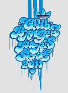
This is a sample of a graffiti font, by Adidas, from thedesigninspiration.com. The feel of this font is one of nonconformism, youthfulness, and freedom of expression. The letterforms, although they all have a consistent look, do not have uniform proportions or uniform baselines or x-lines. They are all made up of organic, flowing lines. The letters themselves have a flowing and curling look to them.
This is a sample of hand painted type from thedesigninspiration.com. The feelings it conveys are a world apart from the feelings that the bank type give. Where the bank type gives a feel of order and predictability, this type is full of a humanly personality. It reflects the effort involved in each hand-painted stroke. The not perfect, exacting sizes of the fonts reflect the non-perfect condition of a human. The thickness of the strokes reflect the level of intensity and emotion of the person who drew them. These letters certainly have more feeling than the bank font.
Directly above is a sample of FHWA Series B font, developed by the U.S. Government in 1945 for road signs (source: wikipedia). The font is a sans-serif and relatively heavy-weighted, which is perfect for easy spotting from a distance. The letterforms are clear and uniform. There is no-nonsense about these letters, although they do have more character to them than the bank font. These letters call out "focus."
The type forming the word "rubber" is an example of distressed typography. It gives a sense of ruggedness and fatigue. It fits perfectly with the message at the top: "are you tired?" The letters are carefully crafted, despite the rugged feel. They are carefully made so that the worn-out parts of the letters look natural. (Image source: dvd-copy.com)
This type design, found on designsiration.com is an example of historical type reused in a contemporary design. This is a photograph of some sort of man-made material in the form of old-style calligraphic letters. This piece has an element of playfulness and intrigue due to the ironic nature of combining tradition with modern technology.
This is a typographical composition found on thedesigninspiration.com with not just interesting color treatment, but dynamic, energized color treatment. It has an invigorating and playful effect. At the same time as it being playful, it still imposes a certain sense of order and maturity, due to the orderly typeface used and due to the letters being all in caps.
This is a sample of neon typography from designinquiry.net. Neon typography reminds me of the 50's and 60's in the U.S. It reminds me of retro-styled fun and action. The choices of color here are not exactly analogous or related to each other in any way, giving a gaudy, not very sophisticated look.
This is an example of Industrial Typography, from behance.net. The letters here are made out of beams of metal, pipes, and other materials that factories are made out of. These letters are effective as something fascinating and playful to look at. These letters are no way effective in terms of legibility.
This is a sample of Chinese typography from designspiration.com. The overall appearance of the composition is stunning. Looking at it gives a calming sense of balance and order, yet the letterforms themselves are so expressive and full of life. The careful planning that went into the layout is apparent. The placement of all the letters is in perfect balance.


