Sunday, December 18, 2011

Font Research

בסד
The following three fonts all reflect the time-period in which they were created.
  1. Sample, Monticello
    Source: Linotype.com
    Monticello
    Monticello, originally called Pica No. 1, was created by a type foundry in Philadelphia in 1796, of Archibald Binny and James Ronaldson. Theirs was the first eminent type foundry in a young United States. Their shop was established in an effort to make the United States more self-sufficient and dependent. The focus in their design, therefore, was to provide type work of comparable quality and style to the type work of Europe.
    In the 1940's, Pica No. 1 was recreated by C.H. Griffith, at which time, he gave the font its current name, Monticello. He revived it for the purpose of having a suitable typeface to print The Papers of Thomas Jefferson. Monticello matches the style of 18th century typefaces. (Creesy) When C.H. Griffith picked up Pica No. 1, his intentions were right in line with its original designers. He wanted to emulate the type of their time-period, just as they did.
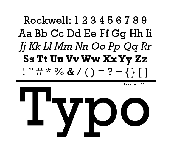
  2. Sample of Rockwell
    Source: Wikimedia Commons
    Rockwell
    Rockwell was originally designed in 1910, by Inland type foundry, of Saint Louis.(Wikipedia; Eckman) Inland was of the most successful type foundries in the late 1800's. When the managers of the foundry represented themselves in advertisements, they described their print as a break from the traditional look. (Eckman)Innovation was the appeal of the time period as the early 1900's was a time of a society of industrialization. The advertising industry was born out of this time period. Display faces were promptly needed for advertisements, for their loudness, boldness, and contemporary look. At this point, Slab-serif fonts were introduced to fill this very purpose (Miklavčic). Rockwell was one of such typefaces; it is a slab-serif font, designed for the purpose of advertising (Typedia).

  3. Sample Universal
    Source: Herbert Bayer, a Study of Bauhaus 
    Universal
    Universal was designed by Herbert Bayer, alumnus and staff member of The Bauhaus (Rothschild).The Bauhaus was a German school of fine arts and crafts, established in 1919.The Bauhaus' unique style of design was a major influence in design. Its mode of design was to achieve harmony between design and function, while keeping to simplest form. This type of design reflected the desires of society precisely. It was post-World War I, the German Monarchy had fallen, and the country was facing an economic recession. Society's focus had turned from emotionalism to practicality. Public interest for Expressionism changed to interest in New Objectivity; the people desired simplicity and orderliness. (Wikipedia)
    Universal was designed by the Bauhaus' very own. It is a sans-serif, geometric font that gives the appearance of starkness and calculated, mathematical design. Universal is a reflection of its time-period.


Bibliography


"Bauhaus." wikipedia.com. n.p., 10 December 2011. Web. 13 Dec. 2011.

Creesy, Charles “Monticello: The History of a Typeface.” press.princeton.edu Princeton University                 Press, 2006. Web. 13 Dec. 2011.

Eckman, JamesThe Inland Type Foundry, 1894-1911.” luc.devroye.org. Luc Devroye, n.d. Web. 13 Dec. 2011

Herbert Bayer, a Study of Bauhaus.”www.type.nu. Noah David Rothschild,
2010. Web. 13 Dec. 2011.

MiklaČic, Mitja “Three chapters in the development of clarendon/ionic typefaces.” www.typefacedesign.org David Březina, 2007–2010. Web. 13 Dec. 201

Rockwell.” typedia.com. n.p., August 31, 2009. Web. 13 Dec. 2011

"Rockwell (typeface)." wikipedia.com. n.p., 13 November 2011. Web. 13 Dec. 2011.


Monday, October 17, 2011

Type Scavenging

Ford's logo is a perfect example of a brand that uses logotype. The distinct look of the font used, in the specific colors, laid out in the way it is, allows us to identify the Ford logo in a split second. The letterforms are thin and elegant looking. At the same time as having a flowing look, the strokes have sharp, defined corners. This look fits a logo for a car company; their products are mechanical, yet elegant.
This is a sample of a bank statement. The font used is here is very simple and light: no serifs. It is easy for reading. The numbers used are stacking numbers, as to be expected, for easy accounting. The simple, minimal font used here gives a feel of organization and precision, which are both important qualities for a bank to have.
This is a perfect sample of childlike type. The forms connote playfulness. . There are no hard edges on these letterforms. They all are thick, uneven in form, and stand slightly askew, creating care-free feeling and a feeling of spontaneity. The non-uniform baseline give the impression that the letters are bouncing. This font effectively conveys the message that Toys R Us is the place for kids.

This is a sample of a graffiti font, by Adidas, from thedesigninspiration.com. The feel of this font is one of nonconformism, youthfulness, and freedom of expression. The letterforms, although they all have a consistent look, do not have uniform proportions or uniform baselines or x-lines. They are all made up of organic, flowing lines. The letters themselves have a flowing and curling look to them. 
This is a sample of hand painted type from thedesigninspiration.com. The feelings it conveys are a world apart from the feelings that the bank type give. Where the bank type gives a feel of order and predictability, this type is full of a humanly personality. It reflects the effort involved in each hand-painted stroke. The not perfect, exacting sizes of the fonts reflect the non-perfect condition of a human. The thickness of the strokes reflect the level of intensity and emotion of the person who drew them. These letters certainly have more feeling than the bank font.

  Directly above is a sample of FHWA Series B font, developed by the U.S. Government in 1945 for road signs (source: wikipedia). The font is a sans-serif and relatively heavy-weighted, which is perfect for easy spotting from a distance. The letterforms are clear and uniform. There is no-nonsense about these letters, although they do have more character to them than the bank font. These letters call out "focus."

The type forming the word "rubber" is an example of distressed typography. It gives a sense of ruggedness  and fatigue. It fits perfectly with the message at the top: "are you tired?" The letters are carefully crafted, despite the rugged feel. They are carefully made so that the worn-out parts of the letters look natural. (Image source: dvd-copy.com)

This type design, found on designsiration.com is an example of historical type reused in a contemporary design. This is a photograph of some sort of man-made material in the form of old-style calligraphic letters. This piece has an element of playfulness and intrigue due to the ironic nature of combining tradition with modern technology.
This is a typographical composition found on thedesigninspiration.com with not just interesting color treatment, but dynamic, energized color treatment. It has an invigorating and playful effect. At the same time as it being playful, it still imposes a certain sense of order and maturity, due to the orderly typeface used and due to the letters being all in caps.  


This is a sample of neon typography from designinquiry.net. Neon typography reminds me of the 50's and 60's in the U.S. It reminds me of retro-styled fun and action. The choices of color here are not exactly analogous or related to each other in any way, giving a gaudy, not very sophisticated look.
This is an example of Industrial Typography, from behance.net. The letters here are made out of beams of metal, pipes, and other materials that factories are made out of. These letters are effective as something fascinating and playful to look at. These letters are no way effective in terms of legibility.

This is a sample of Chinese typography from designspiration.com. The overall appearance of the composition is stunning. Looking at it gives a calming sense of balance and order, yet the letterforms themselves are so expressive and full of life. The careful planning that went into the layout is apparent. The placement of all the letters is in perfect balance.

Wednesday, September 21, 2011

Thoughts On Calligraphy

This past spring semester, I took a calligraphy course. The course was given by a local calligrapher and artist named Mr. Avraham Cohen.

When I first entered his class, I did not have the most positive attitude.  I had just spent an entire semester using Photoshop and Illustrator, and I was enrolled in another course for InDesign for that same semester. I just could not wrap my mind around the value of handwriting letters while you could simply type them up on the computer in a matter of seconds. And it required such focus to draw just one letter! It was all about proportions and angles and keeping your hand steady: all to give the one, simple letter good form. One letter could take half a minute to create! (Especially in the beginning, when I was starting out.)

My struggle to understand the function of Calligraphy was magnified when I started to learn that to do proper calligraphy, you must layout your page by hand! We were all given T-Squares and drawing boards and were taught effective layout skills over a few weeks. How ironic it was to come from my InDesign class and go to my Calligraphy class! It was almost like going back into the dark age.

But then, my instructor would sometimes treat us with showing us samples of his artwork. His daughter had gotten engaged and was to get married that semester. He hand-made her invitation, layout and all. He brought us in an invitation and I started to comprehend. There was no possible comparison to a computer-printed alternative. His invitation was unique and personal. His had so much more feeling and emotion. It came from great effort, thought, and toil. How would it be possible to put as much feeling into an invitation created by a machine?

As the course progressed and the semester passed me by, I was awakened to the value and beauty of hand Calligraphy. My final project for the course is a piece of artwork that I consider very meaningful and valuable to me. Now that I've finished the course, I do not know if I will continue to do calligraphy on my own. I am not sure it is my medium of choice. But I have come out of this course with the gained appreciation and value of something handcrafted with care and with love.

Here is a blog about calligraphy: http://artid.com/members/calligraphy/blog


This website is a great source for design ideas.
http://www.howdesign.com/

This one is about different hand-calligraphed fonts.
http://www.noupe.com/fonts/10-free-beautiful-calligraphic-fonts.html

http://www.cracked.com/funny-5647-fonts/ is a really easy and fun blog about font choice.